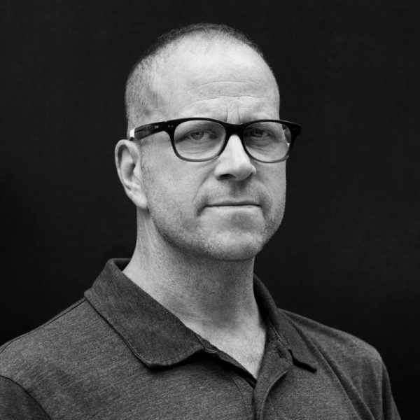
How I Email: Michael McWatters, Director of Experience Design, TED
Email is a non-negotiable part of everyday life. For some, it’s an unruly time suck, but enlightened email users have systems to ensure they’re not a slave to the inbox. We’re asking smart thinkers to give us a peek inside their inboxes, share tips, ideas, gripes, and everything in between.
This week we caught up with design and development guru Michael McWatters, director of experience design at TED in New York City. Michael, who created an email strategy that has been adopted by members of TED’s tech team, says he likes his inbox the same way he likes his designs: “simple, orderly, and communicating clearly what to do next.”
 You’ve previously written about how you manage your inbox (and taught the same method to others at TED). Do you still have the same approach to email? Have you changed anything up?
The only thing I’d nix is the part where I recommend filing emails in folders to get them out of your inbox. It sounds efficient, but the reality is that it doesn’t really solve the problem. It’s like decluttering your house by sticking everything in your attic. Ultimately, your attic becomes a fire hazard that may come crashing through the ceiling. Terrible metaphor, but you get the point. Filing things isn’t really dealing with them, it’s just moving them to another place.
Do you use tools or plugins? If so, which ones do you find most helpful?
I like to keep things simple, so I’m currently using Airmail for Mac and iOS. It streamlines the process of having multiple email accounts, syncs seamlessly across devices, but also offers more advanced features, if that’s your thing. (I make good use of the Snooze and To Do features, for example.)
I’ve tried dozens (no lie) of email clients and utilities over the years, but I prefer a manual approach: read, reply, take action, archive, unsubscribe. It’s like a simple housekeeping ritual or good dental hygiene: if you stay on top of it, you’ll avoid a mess…and dental disease.
You’ve done a lot of interesting design and development projects over the years — creating a soduku app, leading UX design for TED’s video streaming website and more. Using your design and/or development thinking cap, what part of email do you think is most ripe for innovation?
We each deal with email, text, Messenger, Slack, Flowdock, Hangouts, etc. It’s overwhelming and frustrating. I dream of one central messaging app to rule them all. Write and receive all your emails and messages in one place. Choose how you want to send after you’ve written your message, not before. Get one notification instead of dozens. There are huge technical challenges, and certainly no shortage of usability hurdles, but I think our fractured communication experience is ripe for convergence.
What gets you more excited – a full inbox or an empty inbox?
Since my inbox is always at or near empty, it rarely excites me anymore. But if I’ve got more than five or six emails, excitement sets in: sweaty palms, racing heart, shallow breathing. Actually, that might be a panic attack… time to go archive some emails.